Designer Highlight: Moritz Stefaner
The Data Visualization Series is where you’ll find information graphic and data visualization projects, trends, people, stories and perspectives that inspire me.
_________________________
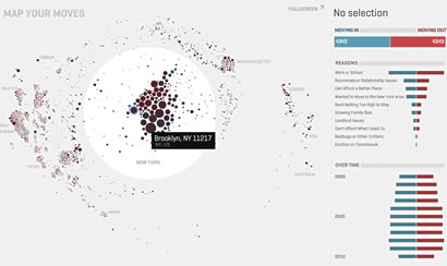
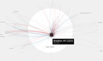
I first encountered Moritz Stefaner‘s talent through his Map Your Moves project, a visual exploration of where New Yorkers moved in the last decade. I was impressed with the simplicity of the interface and the clarity of the data presentation. That’s when I put his name in my hippocampus for future—and admittedly, frequent—recall.
Map Your MovesStefaner is a designer on the crossroads of data visualization, information aesthetics and user interface design. He calls himself an information visualizer and his interests are in information aesthetics, interactive visualization, and how the web transforms our understanding of information. With a background in Cognitive Science and Interface Design, you only need to take a look at his work and you’ll understand why the fields captivated him, and how by weaving them together, he can create amazingly intuitive avenues for interactions between data and us.
well-formed.eigenfactorWisps of vibrant colors mark data points or connections that invites you to interact with them and makes you a participant instead of just an observer. In Map Your Moves, you have the ability to draw back the curtain and take a peek at why people relocate into or out of New York City. The result feels like a cross section of hidden lives—and offers the pleasure of voyeurism without the guilt.
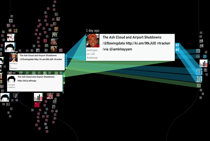
RevisitRevisit project, a real–time visualization of tweets around a specific topic, lets you search for subjects and users. Results then appear on a timeline and user icons are stacked vertically where those with the most mentions lie at the center and are larger. It has a hypnotic fluidity that makes you want to create your own Twitter wall projection or screen for ambiance. What he wanted to achieve is an interface that “provides a sense of the temporal dynamics in the twitter stream, and emphasizes the conversational threads established by retweets and @replies.”1
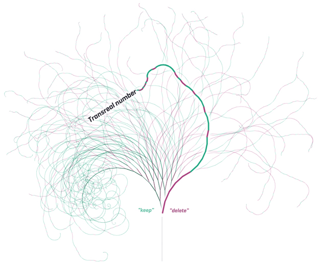
NotabiliaStefaner’s latest data visualization project featured by Fast Company’s Co.Design is Notabilia, which shows the debates behind some of the most controversial Wikipedia entries.2 In his visualization of deletion discussions on Wikipedia, interesting squiggly lines curl across the middle of the page (unanimous), some go scraggly but slowly shot straight up the page (controversial) or the in between s-shaped trajectory (swinging).
What strikes me most in Stefaner’s take on data visualization is his level of abstraction. His work beautifully balances analytical and aesthetic aspects in mapping abstract and complex phenomena, which adds a layer of seductiveness that invites interaction. His data visualization turns visitors into participants.
Looking at his interfaces, data don’t just sit pretty; it moves, weaves, dances and commands you to come play. And that is definitely much appreciated in the land of sitting-pretty infographic.
_________________________
1 Moritz Stefaner: Revisit
2 Fast Company’s Co.Design: Infographic of the Day: The Fiery Debates to Delete a Wikipedia Entry


