Designer Highlight: Nicholas Felton
The Data Visualization Series is where you’ll find information graphic and data visualization projects, trends, people, stories and perspectives that inspire me.
Background:
Data visualization is on the rise recently. You see excellent examples showcased on digital magazine (e.g. GOOD Magazine) or commissioned by corporation (e.g. GE Data Visualization) and organization/institution (e.g. The World Bank, MIT). Discussion & expert panels emerged (e.g. AIGANY) and debates started (e.g. Data Visualization vs. Infographics). It seems appropriate to start a series of posts highlighting the work, the concept and especially the people behind them.
What is an infographic? It is a visual representation of information, data or knowledge that are effective, both artistic and clear in conveying the information to the audience. I’m talking about the good ones, of course, and you know it’s a good one when complex information are explained quickly and clearly, and made you want to explore/interact/play with the data. And with innovative thinking, data visualization brings forward “new and more powerful mechanisms of perception and persuasion.”
_________________________
Recently, I came across some published infographic & data visualization works that are just stunning. They made me wish I did them. (Sadly, I didn’t.) So this is what I can do: Highlight the people behind some of the best ones I’ve seen lately. Today, it’s Nicholas Felton from Feltron.com.
Nicholas Felton frequently designs information graphics for numerous corporations and publications. His work has been profiled in publications including the Wall Street Journal, Wired and Creative Review.
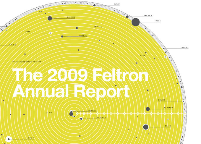
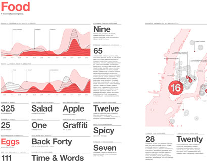
He is best known as the author of several Personal Annual Reports, produced since 2005, that collate countless measurements into a rich assortment of graphs and maps reflecting the year’s activities.
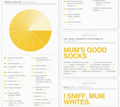
These annual reports showcases not only gorgeous end-of-year visualizations of everything he did from travel to dining to number of pictures taken. Fun and a lot of darn work! So it makes perfect sense that he co-founded Daytum, an elegant and intuitive tool for counting and communicating personal statistics.
The web-based application “lets you ‘Collect, Categorize, and Communicate’ datapoints for any random activity you feel like tracking… and generate endless Feltron-esque visualizations.”1 Of course it comes with an iPhone app just in case you have to update on-the-go.
Back to Felton’s Annual Report, recently it became part of MoMA’s Talk To Me exhibition. MoMa considered it because “it fits our idea of great design: Felton is not only using elegant design to tell an emotional story, but it is also a parody on the corporate Annual Report. By distilling a human being’s emotional state into quantitative information, the visualizations are trying to make sense of how he feels on a given day and along the course of one year. The piece has provoked us to reflect on how we process information.”2
Felton successfully create something interesting and innovative out of things most people find mundane and often discard as useless. His elegant visualizations can be had via the limited-edition, hand-signed and numbered books so you can physically hold these beautiful visualization up close. (p.s.: The 2009 Annual Report is sold out, selling like hot cakes. It’s OK, I’m waiting for the 2010 report.)
_________________________
1 Fast Company’s Co.Design: Daytum iPhone App Turns Your Daily Life Into Infographics
2 MoMA: The 2009 Feltron Annual Report


