Archived entries for nice work

Seeing Red: From Coffee Stains to Socks

Meet Hong Yi aka RED. RED is an artist. She likes to paint but not with a paintbrush. And she made a splash recently with coffee stains and socks. Yes, seriously.

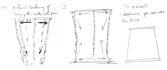
In her latest project, she used 750 pair of socks to create a sock portrait of famous Chinese film director Zhang Yimou. She spent over three weeks on the project and used black, white and grey socks, stringing it using bamboo sticks and stitching patiently until the portrait emerged.

She was inspired by bamboo sticks poking out of windows in the alleyway with laundry hanging onto them. “To me, that was incredibly beautiful. And the amazing thing is seeing something so traditional in a modern, pumping city like Shanghai,” says Yi.

Why Zhang Yimou, the famous Chinese film director behind Hero, House of Flying Daggers, Curse of the Golden Flower, and the Beijing Olympics? According to Yi:

“Many of his movies reflect the beauty of the Chinese culture, through the use of bamboos and traditional costumes. I thought Zhang Yimou’s portrait done in a Shanghainese laneway, with bamboo and laundry would be perfect for this project.”


She ended up using 750 pairs of socks (shirts were too big and expensive) and she found an interesting way to pin the socks together, creating a diamond-shaped piece of skin. “It was interesting to see the different angles of shadows casted on it throughout the day,” she added.

Yi is not new to using unusual objects as a tool for creating her art. In February, she created a portrait of Jay Chou (a Taiwanese musician, singer-songwriter, music and film producer, actor and director) a using nothing but Nescafe coffee stains on the bottom of a mug.

She was inspired by the first in Jay Chou’s song, ‘Secret’ about lifting a coffee cup off the saucer and the last line, about autumn leaves and fragmented pieces. Hundreds of individual coffee stain rings, many of them broken and imperfect like fallen autumn leaves, formed a whole portrait:

“The singer tells a heartbreak tale of a lost romance with a girl from 1979 who time-traveled forward 20 years and met Jay in 1999, and they fell in love. She then went back to 1979 and sketched a portrait of him. My painting is meant to look like a sepia-toned old photograph to capture the essence of this story.”


The project took about 12 hours to finish. Yi admits that coffee is “quite a challenging medium to use — too little water and the rings wouldn’t form easily, too much water and the rings would blend into each other, resulting in just a deformed pool of coffee. I had to also wait for the lighter parts too dry up before stamping on the darker rings, or else the rings would not be visible.”

As a little kid, she dreamt of becoming an artist. Modestly, she explains how she creates her art: “I like to grab whatever I can get hold of – rocks, ketchup, milk, salt, shirts — and turn them into art. It’s more fun that way!”

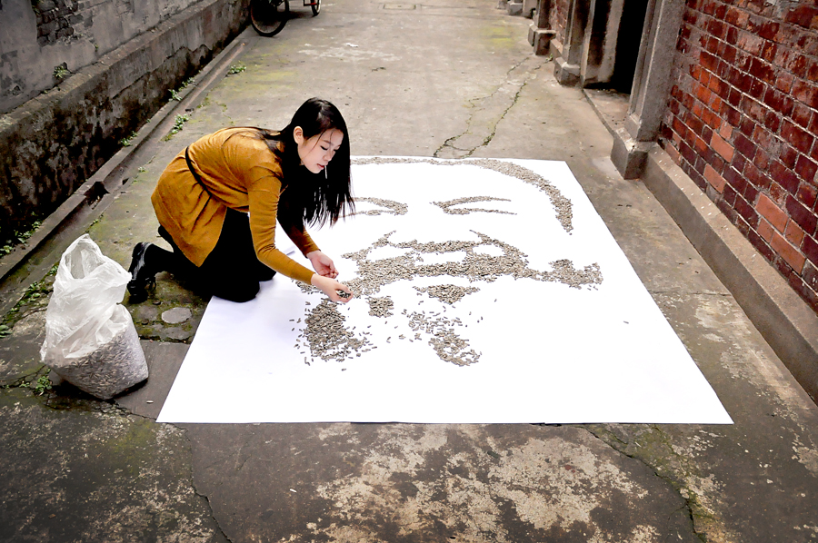
Check out her art, like the Yao Ming potrait and the homage to the controversial Ai Weiwei using 100,000/7kgs of sunflower seeds.

You go, Red! Visit her blog, Oh I see Red!

So Goude: Goudemalion. A Retrospective.

The first-ever retrospective of the work of Jean-Paul Coude, a French graphic designer, illustrator, photographer and advertising film director. You may not know of him but you’ve seen his iconic work.

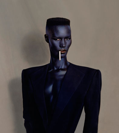
‘Blue-black in Black on Brown’, New York, 1981

 
Opening at the Musée des Arts Décoratifs on Friday is the retrospective ‘Goudemalion’ of the work of Jean-Paul Coude, a defining 80’s artist, art director, photographerand image maker. The exhibition examines the work through the lens of the Pygmalion myth — a humorous nod to his most important muse, lover and the mother of his son, Grace Jones, to whom he is, as he laughingly puts it, her ‘Pygmalion.’1

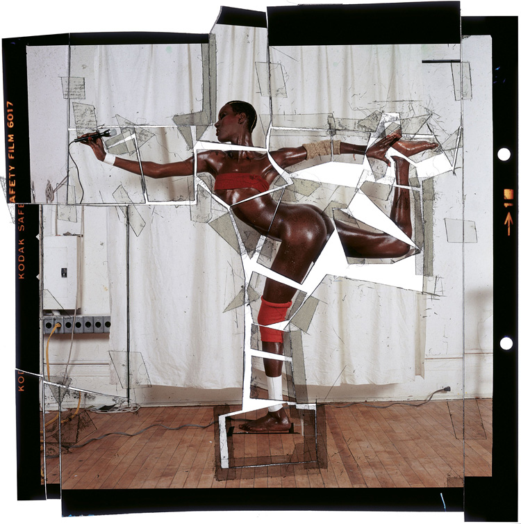
Goude didn’t like studying; in his own words he “was bad at it.” Luckily he was good at drawing. He began his career in the 1960s as an illustrator for the department store Printemps in Paris. he began his career in the 1960s as an illustrator. In 1964 he became the Artistic Director for Esquire in New York and 10 years later, he joined New York Magazine. It was there that he first met and photographed Jones and became instrumental in honing her public image, exaggerating her androgyny and producing many striking work, including the famous photograph of her impossibly twisted pose used on the cover of her 1985 album, Island Life.

‘Grace revue et corrigée’ (Grace re-visited), New York, 1978


Azzedine et Farida, Paris, 1985

 
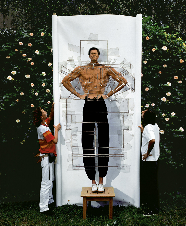
First published in New York Magazine in 1978, this image is in fact a montage of several photographs spliced together. In the days before Photoshop, this was Goude’s trademark: Using scissors to chop up photographs and then reassemble them, elongating limbs and exaggerating lines and curves. He called this technique ‘French Correction’2 — which is mostly concerned with glorifying and revealing the body, by exaggerating and subliming it. He redesigns the bodies of his models, photographing then transforming them.3

Aside from creating several well-known campaigns for brands such as Perrier, Citroën and Chanel, Goude is also a filmmaker; his film ‘Heartbeat’ traces his eclectic influences and highlights his diverse portfolio which has led to some describing him as a ‘polymath’. What is apparent from the film is that Goude was and is heavily influenced by black American culture and French colonialism — a result of having grown up in a predominantly black neighborhood in France. “I was an illustrator who used to illustrate other people’s fantasy. I naturally became an “image maker,” he says.

Designed by Goude himself, the retrospective is a giant installation retracing his 40 year career. The show is organized into different sections: One a chronological journey from his early days to his most recent work, another recreating the most celebrated moments of his career — special areas dedicated to his most influential projects: Les Galeries Lafayette, cut-up slides, neon furniture, Chanel, and his muses, from Toukie Smith to Grace Jones to Karen, his last muse and current wife.3

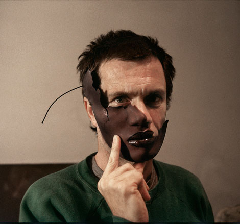
Self-portrait, New York, 1982

 
According to Amelie Gastaut, co-curator of the exhibition:

For Jean-Paul Goude, as for those of us who curated the show, there’s not much difference between Applied Art, commercial arts and Fine Arts. Behind each of these lies an artist and his singular and original universe. When the advertising world solicited his work in 1982, he had started his artistic career for about 20 years, and he’s still a major element of today’s French artistic scene.5


A highlight of this season’s cultural programme, surprisingly, it will be the first ever retrospective of the work of the now-iconic Goude on the French advertising and fashion scenes. And the perfect opportunity for viewers to gain an understanding of his unique world view.

‘Le Noir’ self-portrait, New York, 1982

 
Visit jeanpaulgoude.com

Goudemalion opens today and runs through March 18, 2012. More info (in French only): Les Arts Décoratifs — Goudemalion. Jean-Paul Goude une rétrospective

_________________________

1,2Wallpaper: Goudemalion: Jean-Paul Goude retrospective, Paris

3,5Elle: Jean-Paul Goude Paris Exhibition

4Art Photo Expo: Jean-Paul Goude

Photo credit: Jean-Paul Goode®

BBC 3.0

Remember the brouhaha over BBC redesign last year? Apparently a lot of people are just not loving it. According to the Guardian article Website users give BBC News redesign grief (and anger, and bargaining…), “the responses sometimes look like the five stages of mourning.” A hefty 4,242 comments have been published in response to the well-intentioned posts in the past 16 days, most spitting feathers but some leaving questions yet to be answered.

Although BBC claimed it lived with and loved the distinctly ‘web 2.0’ design for a while now and it’s done them proud, it time to move on and before the end of  last year they resurrect the redesign project.

BBC stated:

We set out to broaden our ambitions; to create a design philosophy and world-class design standards that all designers across the business could adhere to. We wanted to find the soul of the BBC. We wanted something distinctive and recognizable; we wanted drama. We knew whatever we created needed to be truly cross-platform and that we needed to simplify our user journeys.


This is where Neville Brody and his agency, Research Studios, comes in. have collaborated closely with the BBC to redesign their online Global Visual Language (GVL) and take the organization and its users into a more compelling digital space. At the heart of the project was the joint desire to bring joined-up cross platform concepts and experiences to users of bbc.co.uk and bbc.com now and into the future.

Here’s their recap:

After four months, countless hours and countless iterations of designs, components, mastheads, footers, polar maps, word documents, PDFs and grids…, this is the latest in BBC’s design philosophy and the latest version of their global visual language styleguide.

The team wanted to create a design philosophy, or a set of values, to unite the user experience practitioners across the business. They settled on nine keywords which we think sum up what we’re about and what they’re trying to achieve:

Modern British
We want to create a modern British design aesthetic, something vibrant and quirky that translates outside our national boundaries.

Current
It needs to feel current and reflect what’s happening in the UK right now, in real-time. We curate a timeline of Britain and create links to the past – to our rich archive.

Authentic
Wherever we are heard we need to sound authentic and relevant, warm and human. We want to reference the BBC’s iconic design and broadcasting heritage. We value the trust placed in us.

Compelling
We engage our audiences with compelling storytelling. Our voice ranges from serious and authoritative through to witty and entertaining.

Distinctive
We stand out from the crowd. We strike a balance between overly templated, cookie-cutter design and beautiful anarchy. We are bold and dramatic.

Pioneering
We pioneer design innovations that surprise and delight. But we take our audiences with us.

Joined-up
We view all services and platforms as one connected whole but deliver experiences that are sensitive to their context of use.

Universal
Our services are open and accessible. Our interfaces are simple, useful and intuitive.

Best
Our ambition is to be the best digital media brand in the world.


Armed with the new philosophy, they began creating conceptual designs for various properties: BBC news, homepage, search, iPlayer, program pages and the embedded media player.

Through doing this work we began to distill the essence of a new visual style. Here are some of the key elements, starting with the page grid.

The new grid is based on 31 sixteen pixel columns with two left hand columns that can be split into four, and one wider right hand column, which accommodates the ad formats that appear on the international facing version of the site.

11-grid.jpg

They’re looking to create the effect of interwoven vertical and horizontal bands, making a feature of the right hand column across the site.

12-grid.jpg

Along with the 16 pixel vertical grid they’ve also for the first time got an integrated 8 pixel baseline grid so that they can align elements on a page both vertically and horizontally.

13-baseline.jpg

A key feature of the new GVL is a much more dramatic use of typography. As well as Gill Sans they’ve introduced big bold type in Helvetica or Arial and restricted variations in size so that they have much greater consistency across the site.

14-type.gif

They’ve developed a highlight colour palette for non-branded areas of the site, or areas where the BBC masterbrand talks directly to the audience (e.g. the BBC homepage, search, some of our genre areas). Each color has a tonal range to be used in contrast or in unison with each other.

20-colour.jpg

_________________________

The redesign covers a lot of grounds. It goes to show you that it’s not just a “re-skin” as clients like to call site redesigns, which often times gets me going.

A website redesign is not just changing colors and moving things here and there; It’s analyzing the existing website and the interactive landscape, looking at comparable companies within and outside the industry, and exploring potential improvements based on best practices and audience expectation.

If you do it right: It’s not just a redesign. It’s a rebirth.

To read more: A new global visual language for the BBC’s digital services

Post-it Like Crazy

Brazilian shoe brand Melissa takes 3M’s Post-it notes and stop-motion animated films into a massive new level.

Using 350,000 of the colorful stickies in the U-shaped foyer of Melissa’s flagship store in São Paulo, the Post-its act as “pixels” in the video, with become these impressively trippy images of prancing elephants, balloons lifting folks aloft and pulsating heart-flowers. It’s part of the brand’s “Power of Love” campaign, which was appropriate because it took 25 animators five months to create and I bet they loved every moment of it. 🙂

On top of the animation, the company got passers-by to jot down messages on 30,000 Post-its, and it has since gone viral online. There are some environmental types who are concern about the ultimate fate of all those notes, but I don’t see why you can’t totally recycle those notes by passing it to the next person. It’s the power of love, man.

Make sure you watch the making of it.

Via Adweek

Sharpie Taps Into Self-Expression

I love Sharpies. I always have one with me. They can be fine or fat markers or anything in between; I’ve used them to doodle in class since I can remember, and I can always rely on my red fine point to mark up anything (yes, the dreaded “Imelda is marking up the printouts again”). And I have the ink-stained fingers to proof it.

_________________________

Sharpie’s latest campaign, Start with Sharpie, draws on “Self-Expression,” and it reminds me of all the things I love to do growing up: Writing, drawing, tic tac toe, crosswords, “permanent” tattoos (yea, you had one of those). It taps into the idea that Sharpie gets you to express yourself, be creative and make anything you want. With nearly two-million incredible Facebook fans, what’s better than using their avid fans?

They recruited three of their Sharpie Squad members: Cheeming Boey (you may say “Jimmy who?” but get ready to be blown away), Erica Domesek (DIY Expert) & Mark Rivard (skateboard artist).

Cheeming Boey

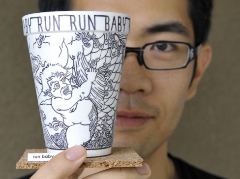
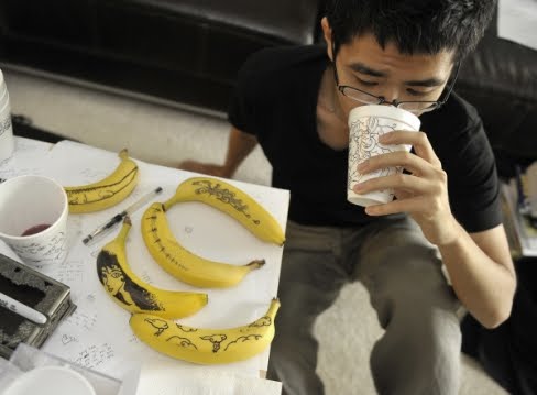
Cheeming Boey is the “coffee cup artist” who drew intricate, finely-detailed drawings on those 4-cent Styrofoam cups with a Sharpie. Styrofoam gets a bad rap because it’s cheap, disposable and it never degrades. A landfill nightmare. But Cheeming has turned it into something you gape at.

“About the only time it makes the news is when some city bans its use – as more than 20 California cities have done. Or when some art auction sells a foam cup with a dead ladybug in it for $29,900 – as happened in 2001. All of which makes the simple, 4-cent cup the epitome of pop art. It’s at once kitschy and unhip and dismissed by all. Yet it can be a demanding medium to master. It’s curved. It smudges. You can’t redo mistakes. And every drawing must re-connect to its start.”


Cheeming’s work has been displayed in galleries nationwide. In his ad, Cheeming demonstrates how a Sharpie Pen and a simple Styrofoam cup can be combined to create something truly inspiring.

Note that not even bananas are safe from his wandering Sharpies. In this picture, “mistake” cups are used for drinking.

Erica Domesek


A DIY expert, author and creator of P.S.- I Made This, Erica’s creations are inspired by some of the biggest names in fashion. She has been featured in top entertainment and fashion media, and both her website and her book feature several Sharpie DIY projects. In her Sharpie ad, Erica breathes new life into a standard-issue pencil case using new Stained by Sharpie® fabric markers to create a chic purse.

The good news is you can make too—just follow the steps listed in the D.I.Y. with Domesek blog post!

Mark Rivard


Mark is a super-talented skateboard artist who has figured out how to manipulate Sharpie markers like a paintbrush to create some amazing skateboard art, complete with the kind of nuanced brush strokes and shading that makes a Sharpie blog editor proud. Using skateboards as his canvas, Mark’s designs have appeared in sports commercials and viewed in galleries worldwide. Mark demonstrates how he uses Sharpie Mini markers to create coveted custom boards.

In addition, the print campaigns will include QR codes where you can unlock exclusive content and videos of each Sharpie project.

The campaign supposedly aimed at teenagers, with new website to boot (not too crazy about it). However, I don’t feel that it alienates older age groups (heck, I’m in that way older age group), so one fat check mark for you, Sharpie!

To read all about it, go to blog.sharpie.com

_________________________

Images courtesy of Sharpie


Red Pepper Flakes © 2008 - 2011. All rights reserved.

RSS Feed Content by Imelda Suriato